13. Graphics
This open-access textbook is, and will remain, freely available for everyone’s enjoyment (also in PDF; a paper copy can also be ordered). It is a non-profit project. Although available online, it is a whole course, and should be read from the beginning to the end. Refer to the Preface for general introductory remarks. Any bug/typo reports/fixes are appreciated. Make sure to check out Minimalist Data Wrangling with Python [28], too.
The R project homepage advertises our free software as an environment for statistical computing and graphics. Hence, had we not dealt with the latter use case, our course would have been incomplete.
R is nowadays equipped with two independent (incompatible, yet coexisting) systems for graphics generation; see Figure 13.1.
The (historically) newer one, grid (e.g., [49]), is very flexible but might seem complicated. Some readers might have come across the lattice [54] and ggplot2 [61, 64] packages before: they are built on top of grid.
On the other hand, its traditional (S-style) counterpart, base graphics (e.g., [7]), is much easier to master. It still gives their users complete control over the drawing process. It is simple, fast, and minimalist, which makes it very attractive from the perspective of this course’s philosophy.
This is why we only cover the second system here. Most importantly, all figures in this book were generated using graphics and its dependants. They are sufficiently aesthetic, aren’t they? Form precedes essence (but see [57, 60]).
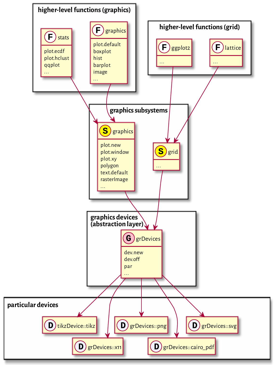
Figure 13.1 Relation between the graphics subsystems.
13.1. Graphics primitives
In graphics, we do not choose from a superfluity of virtual objects to be placed on an abstract canvas, letting some algorithm decide how and when to delineate them. We just draw. We do so by calling functions that plot the following graphics primitives (see, e.g., [37, 45]):
symbols (e.g., pixels, circles, stars) of different shapes and colours,
line segments of different styles (e.g., solid, dashed, dotted),
polygons (optionally filled),
text (using available fonts),
raster images (bitmaps).
That’s it. It will turn out that all other shapes (smooth curves, circles) may be easily approximated using the above.
Of course, in practice, we do not always have to be so low-level. There are many functions that provide the most popular chart types: histograms, bar plots, dendrograms, etc. They will suit our basic needs. We will review them in Section 13.3.
The more primitive routines we discuss next will still be of service for fine-tuning our figures and adding further details. However, if the prefabricated components are not what we are after, we will be able to create any drawing from scratch.
Important
In graphics, most of the function calls have immediate effects. Objects are drawn on the active plot one by one, and their state cannot be modified later.
Figure 13.2 depicts some graphics primitives, which we plotted using the following program. We will detail the meaning of all the functions in the next sections, but they should be self-explanatory enough for us to be able to find the corresponding shapes in the plot.
par(mar=rep(0.5, 4))  # small plot margins (bottom, left, top, right)
plot.new()  # start a new plot
plot.window(c(0, 6), c(0, 2), asp=1)  # x range: 0–6, y: 0–2; proportional
x <- c(0, 0, NA, 1, 2, 3, 4, 4, 5,    6)
y <- c(0, 2, NA, 2, 1, 2, 2, 1, 0.25, 0)
points(x[-(1:6)], y[-(1:6)])  # symbols
lines(x, y)   # line segments
text(c(0, 6), c(0, 2), c("(0, 0)", "(6, 2)"), col="red")  # two text labels
rasterImage(
    matrix(c(1, 0,  # 2x3 pixel "image"; 0=black, 1=white
             0, 1,
             0, 0), byrow=TRUE, ncol=2),
    5, 0.5, 6, 2,  # position: xleft, ybottom, xright, ytop
    interpolate=FALSE
)
polygon(
    c(4, 5, 5.5,    4),  # x coordinates of the vertices
    c(0, 0,   1, 0.75),  # y coordinates
    lty="dotted",   # border style
    col="#ffff0044"  # fill colour: semi-transparent yellow
)
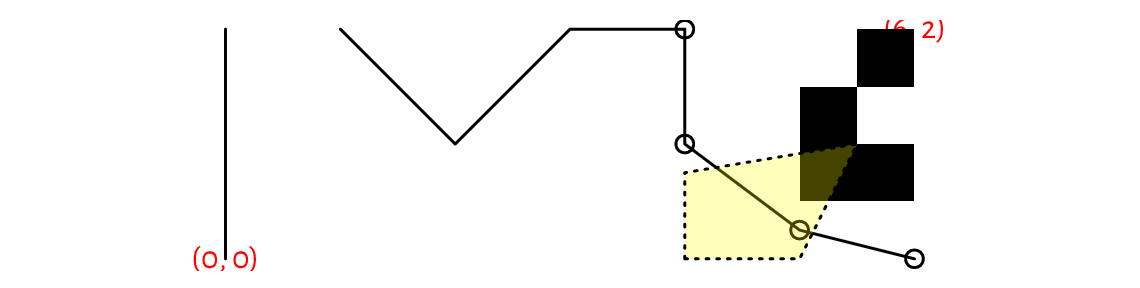
Figure 13.2 Graphics primitives: plotting symbols, line segments, polygons, text labels, and bitmaps. Objects are added one after another, with newer ones drawn over the already existing shapes.
13.1.1. Symbols (points)
The points function can draw a series
of symbols (by default, circles) on the two-dimensional
plot region, relative to the user coordinate system.
We specify the points’ coordinates using the x and y arguments
(two vectors of equal lengths; no recycling).
Alternatively, we may give a matrix or a data frame with two columns:
its first column (regardless of how and if it is named)
defines the abscissae, and the second column determines the ordinates.
This function permits us to plot each point differently if this
is what we desire. Thus, it is ideal for drawing scatter plots,
possibly for grouped data (see Figure 13.17 below).
It is vectorised with respect to, amongst others,
the col (colour; see Section 13.2.1), cex (scale, defaults to 1),
and pch (plotting character or symbol, defaults to 1, i.e., a circle)
arguments.
Figure 13.3 gives an overview of the plotting symbols available. The most often used ones are:
NA_integer_– no symbol,0, …,14and15, …,18– unfilled and filled symbols, respectively;19, …,25– filled symbols with a border of widthlwd; for codes21, …,25, the fill colour is controlled separately by thebgparameter,"."– a tiny point (a “pixel”),"a","1", etc. – a single character (not all Unicode characters can be drawn); strings longer than one will be truncated.
par(mar=rep(0.5, 4)); plot.new(); plot.window(c(0.9, 9.1), c(0.9, 4.1))
points(
    cbind(1:9, 1),  # or x=1:9, y=rep(1, 9); bottom row
    col="red",
    pch=c("A", "B", "a", "b", "Spanish Inquisition", "*", "!", ".", "9")
)
xy <- expand.grid(1:9, 4:2)
text(xy, labels=0:(NROW(xy)-1), pos=1, cex=0.89, offset=0.75, col="darkgray")
points(xy, pch=0:(NROW(xy)-1), bg="yellow")
## Warning in plot.xy(xy.coords(x, y), type = type, ...): unimplemented pch
##     value '26'
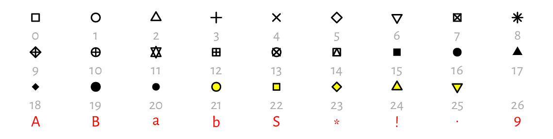
Figure 13.3 Plotting characters and symbols (pch).
13.1.2. Line segments
lines can draw connected line segments whose mid- and endpoints are given in a similar manner as in the points function. A series of segments can be interrupted by defining an endpoint whose coordinate is a missing value; compare Figure 13.2.
Actually, points and lines are wrappers around the same function, plot.xy, which we usually do not call directly.
Their type arguments determine the object to draw;
the only difference is that by default the former uses type="p"
whilst the latter relies on type="l" .
Changing these to type="b" (both) or type="o" (overplot) will give
their combination. Moreover, type="s" and type="S" creates step
functions (with post- and pre-increments, respectively),
and type="h" draws bar plot-like vertical lines.
For an illustration, see Figure 13.4
(implement something similar yourself as an exercise).
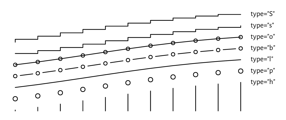
Figure 13.4 Different type argument settings in lines or points.
The col argument controls the line colour (see Section 13.2.1),
and lwd determines the line width (1 by default). Six named line types
(lty) are available, which can also be specified via their respective
numeric identifiers, lty=1, …, lty=6; see Figure 13.5
(implementing a similar plot is left as an exercise). Additionally, custom
dashes can be defined using strings of up to eight hexadecimal digits.
Consecutive digits give the lengths of the dashes and blanks (alternating).
For instance, lty="1343" yields a dash of length 1, followed by a space of
length 3, then a dash of length 4, followed by a blank of length 3.
The whole sequence will be recycled for as long as necessary.
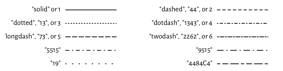
Figure 13.5 Line types (lty).
lines can be used for plotting empirical cumulative distribution functions (we will suggest it as an exercise later), regression models (e.g., lines, splines of different degrees), time series, and any other mathematical functions, even when they are smooth and curvy. The naked eye cannot tell the difference between a densely sampled piecewise linear approximation of an object and its original version. The code below illustrates this (sad for the high-hearted idealists) truth using the sine function; see Figure 13.6.
ns <- c(seq(3, 25, by=2), 50, 100)
par(mar=rep(0.5, 4)); plot.new(); plot.window(c(0, length(ns)*pi), c(-1, 1))
for (i in seq_along(ns)) {
    x <- seq((i-1)*pi, i*pi, length.out=ns[i])
    lines(x, sin(x))
    text((i-0.5)*pi, 0, ns[i], cex=0.89)
}
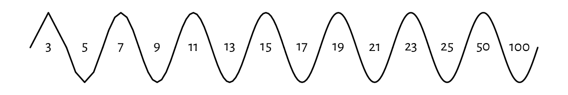
Figure 13.6 The sine function approximated with line segments. Sampling more densely gives the illusion of smoothness.
Implement your version of the segments function using a call to lines.
(*) Implement a simplified version of the arrows function,
where the length of edges of the arrowhead is given in user coordinates
(and not inches; you will be equipped with skills to achieve this
later; see Section 13.2.4).
Use the ljoin and lend arguments (see help("par") for admissible values)
to change the line end and join styles (from the default rounded caps).
13.1.3. Polygons
polygon draws a polygon with a border of specified
colour and line type (border, lty, lwd).
If the col argument is not missing, the polygon is filled
(or hatched; cf. the density and angle arguments).
Let’s draw a few regular (equilateral and equiangular) polygons; see Figure 13.7. By increasing the number of sides, we can obtain an approximation to a circle.
regular_poly <- function(x0, y0, r, n=101, ...)
{
    theta <- seq(0, 2*pi, length.out=n+1)[-1]
    polygon(x0+r*cos(theta), y0+r*sin(theta), ...)
}

par(mar=rep(0.5, 4)); plot.new(); plot.window(c(0, 9.5), c(-1, 1), asp=1)
regular_poly(1, 0, 1, n=3)
regular_poly(3.5, 0, 1, n=7, density=15, angle=45, col="tan", border="red")
regular_poly(6, 0, 1, n=10, density=8, angle=-60, lty=3, lwd=2)
regular_poly(8.5, 0, 1, n=100, border="brown", col="lightyellow")

Figure 13.7 Regular polygons drawn using polygon.
Note the asp=1 argument to the plot.window function
(which we detail below) that guarantees the same scaling of the
x- and y-axes. This way, the circle looks like one and not an oval.
Notice that the last vertex adjoins the first one. Also, if we are absent-minded (or particularly creative), we can produce self-intersecting or otherwise degenerate shapes.
Implement your version of the rect function using a call to polygon.
13.1.4. Text
A call to text draws arbitrary strings (newlines and tabs
are supported) centred at the specified points.
Moreover, by setting the pos argument, the labels may be placed
below, to the left of, etc., the pivots.
Some further position adjustments are also possible (adj, offset);
see Figure 13.8.
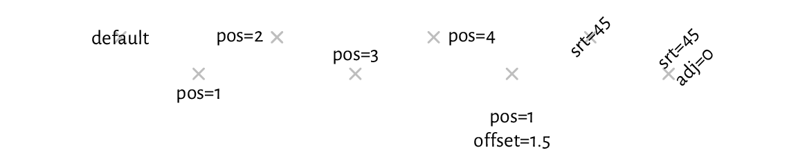
Figure 13.8 The positioning of text with text (plotting symbols added for reference).
col specifies the colour, cex affects the size, and srt
changes the rotation of the text.
On many graphics devices, we have little but crude control over
the font face used: family chooses a generic font family
("sans", "serif", "mono"), and font
selects between the normal variant (1), bold (2),
italic (3), or bold italic (4).
See, however, Section 13.2.6 for some workarounds.
Note
(*) There is limited support for mathematical symbols and formulae. It relies
on some quirky syntax that we enter using unevaluated R expressions
(Chapter 15). Still, it should be enough to meet our most basic
needs. For instance, passing quote(beta[i]^j)
as the labels argument to text will output “\(\beta_i^j\)”.
See help("plotmath") for more details.
For more sophisticated mathematical typesetting, see the tikzDevice graphics device mentioned in Section 13.2.6. It outputs plot specifications that can be rendered by the LaTeX typesetting system.
13.1.5. Raster images (bitmaps) (*)
Raster images are encoded in the form of bitmaps, i.e., matrices whose elements represent pixels (see Figure 13.2 for an example). They can be used for drawing heat maps or backgrounds of contour plots; see Section 13.3.4.
Optionally, bilinear interpolation can be applied if the drawing area is larger than the true bitmap size, and we would like to smoothen the colour transitions out. Figure 13.9 presents a very stretched \(4\times 3\) pixel image, with and without interpolation.
par(mar=rep(0.5, 4)); plot.new(); plot.window(c(0, 9), c(0, 1))
I <- matrix(nrow=4, byrow=TRUE,
    c(   "red", "yellow",  "white",
      "yellow", "yellow", "orange",
      "yellow", "orange", "orange",
       "white", "orange",    "red")
)
rasterImage(I, 0, 0, 4, 1)  # interpolate=TRUE; left subplot
rasterImage(I, 5, 0, 9, 1, interpolate=FALSE)  # right subplot

Figure 13.9 Example bitmaps drawn with rasterImage, with (left) and without (right) colour interpolation.
13.2. Graphics settings
par can be used to query and modify (as long
as they are not read-only) many graphics options.
For instance, we have several parameters related to the current page
or device settings,
e.g., the plot’s margins (see Section 13.2.2)
or user coordinates (see Section 13.2.3).
The reference list of available parameters is given in help("par").
Below we discuss the most noteworthy ones.
Moreover, some functions source[1] the values of their default
arguments by querying par. This is the case of,
e.g., col, pch, lty in the points and lines
function.
Study the following pseudocode.
lines(x, y)  # use the default `lty`, i.e., par("lty") == "solid"
old_settings <- par(lty="dashed")  # change setting, save old for reference
lines(x, y)  # use the new default `lty`, i.e., par("lty") == "dashed"
lines(x, y, lty=3)  # use the given `lty`, but only for this call
lines(x, y)  # default lty="dashed" again
par(old_settings)  # restore the previous settings
lines(x, y)  # lty="solid" now
13.2.1. Colours
Many functions allow for customising colours of the plotted objects
or their parts; compare, e.g., col and border arguments
to polygon, or col and bg to points.
There are a few ways to specify colours
(see the Colour Specification section of help("par") for more details).
We can use a
"colour name"string, being one of the 657 predefined tags known to the colours function:sample(colours(), 8) # this is just a sample ## [1] "grey23" "darksalmon" "tan3" "violetred4" ## [5] "lightblue1" "darkorchid3" "darkseagreen1" "slategray3"
We can pass a
"#rrggbb"string, which specifies a position in the RGB colour space: three series of hexadecimal numbers of two digits each, i.e., between \(\text{00}_\text{hex}=0\) (off) and \(\text{FF}_\text{hex}=255\) (full on), giving the intensity of the red, green, and blue channels[2].In practice, the col2rgb and rgb functions can convert between the decimal and hexadecimal representations:
C <- c("black", "red", "green", "blue", "cyan", "magenta",
    "yellow", "grey", "lightgrey", "pink")  # example colours
(M <- structure(col2rgb(C), dimnames=list(c("R", "G", "B"), C)))
##   black red green blue cyan magenta yellow grey lightgrey pink
## R     0 255     0    0    0     255    255  190       211  255
## G     0   0   255    0  255       0    255  190       211  192
## B     0   0     0  255  255     255      0  190       211  203
structure(rgb(M[1, ], M[2, ], M[3, ], maxColorValue=255), names=C)
##     black       red     green      blue      cyan   magenta    yellow
## "#000000" "#FF0000" "#00FF00" "#0000FF" "#00FFFF" "#FF00FF" "#FFFF00"
##      grey lightgrey      pink
## "#BEBEBE" "#D3D3D3" "#FFC0CB"
An
"#rrggbbaa"string is similar, but has the added alpha channel (two additional hexadecimal digits): from \(\text{00}_\text{hex}=0\) denoting fully transparent, to \(\text{FF}_\text{hex}=255\) indicating fully visible (lit) colour; see Figure 13.2 for an example.Semi-transparency (translucency) can significantly enhance the expressivity of our data visualisations; see Figure 13.18 and Figure 13.19.
We can rely on an integer index to select an item from the current palette (with recycling), which we can get or set by a call to palette. Moreover,
0identifies the background colour, par("bg").Integer colour specifiers are particularly valuable when plotting data in groups defined by factor objects. The underlying integer level codes can be mapped to consecutive colours from any palette; see Figure 13.17 below for an example.
We recommend memorising the colours in the default palette:
palette()  # get current palette
## [1] "black"   "#DF536B" "#61D04F" "#2297E6" "#28E2E5" "#CD0BBC" "#F5C710"
## [8] "gray62"
These are[3], in order: black, red, green, blue, cyan, magenta, yellow, and grey; see[4] Figure 13.10.
k <- length(palette())
par(mar=rep(0.5, 4)); plot.new(); plot.window(c(0, k+1), c(0, 1))
points(1:k, rep(0.5, k), col=1:k, pch=16, cex=3)
text(1:k, 0.5, palette(), pos=rep(c(1, 3), length.out=k), col=1:k, offset=1)
text(1:k, 0.5, 1:k, pos=rep(c(3, 1), length.out=k), col=1:k, offset=1)

Figure 13.10 The default colour palette.
Choosing usable colours requires talents that most programmers lack. Therefore, we will find ourselves relying on the built-in colour sets. palette.pals and hcl.pals return the names of the available discrete (qualitative) palettes. Then, palette.colors and hcl.colors (note the American spelling) can generate a given number of colours from a particular named set.
Continuous (quantitative) palettes are also available, see rainbow, heat.colors, terrain.colors, topo.colors, cm.colors, and gray.colors. They transition smoothly between predefined pivot colours, e.g., from blue through green to brown (like in a topographic map with elevation colouring). They may be of use, e.g., when drawing contour plots; compare Figure 13.27.
Create a demo of the aforementioned palettes in a similar (or nicer) style to that in Figure 13.11.
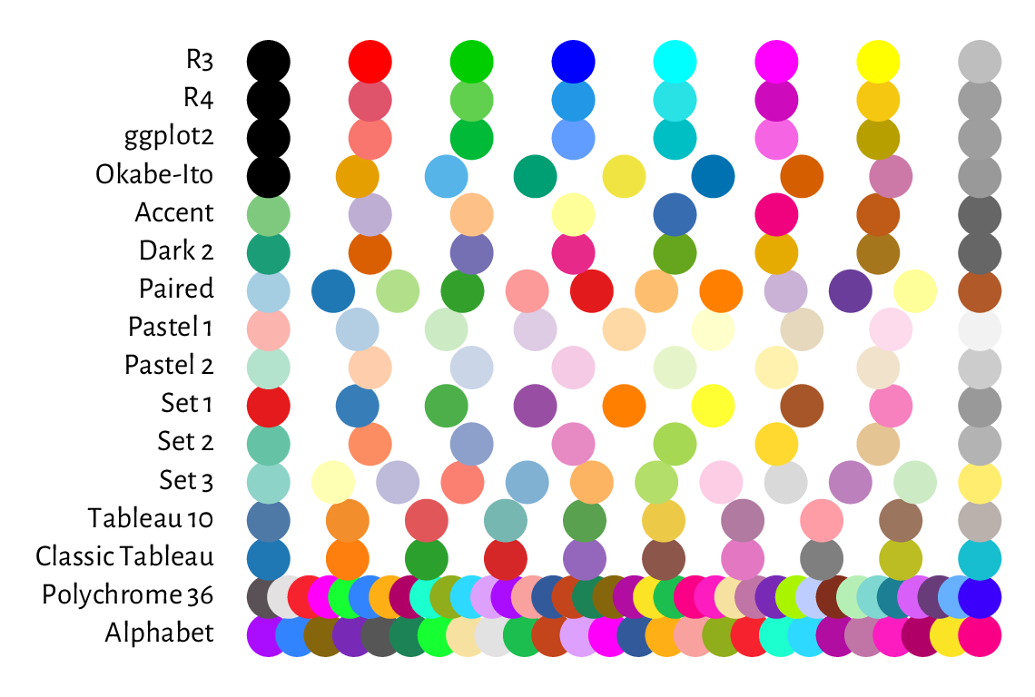
Figure 13.11 Qualitative colour palettes in palette.pals; R4 is the default one, as seen in Figure 13.10.
13.2.2. Plot margins and clipping regions
A device (page) region represents a single plot window, one raster image file, or a page in a PDF document (see Section 13.2.6 for more information on graphics devices). As we will learn from Section 13.2.5, it is capable of holding many figures.
Usually, however, we draw one figure per page. In such a case, the device region is divided into the following parts:
outer margins, which can be set via, e.g., the
omagraphics parameter (in text lines, based on the height of the default font); by default, they are equal to 0;figure region:
a) inner (plot) margins, by default
mar=c(5.1, 4.1, 4.1, 2.1)text lines (bottom, left, top, right, respectively); this is where we usually emplace the figure title, axes labels, etc.b) plot region, where we draw graphics primitives positioned relative to the user coordinates.
Note
Typically, all drawings are clipped to the plot region,
but this can be changed with the xpd parameter;
see also the more flexible clip function.
Figure 13.12 shows the default page layout. In the code chunk below, note the use of mtext to print a text line in the inner margins, box to draw a rectangle around the plot or figure region, axis to add the two axes (labels and tick marks), and title to print the descriptive labels.
plot.new(); plot.window(c(-2, 2), c(-1, 1))  # whatever
for (i in 1:4) {  # some text lines on the inner margins
    for (j in seq_len(par("mar")[i]))
        mtext(sprintf("Text line %d on inner margin %d", j, i),
            side=i, line=j-1, col="lightgray")
}

title(main="Main", sub="sub", xlab="xlab", ylab="ylab")
box("figure", lty="dashed")  # a box around the figure region
box("plot")   # a box around the plot region
axis(1)  # horizontal axis (bottom)
axis(2)  # vertical axis (left)

rect(-10, -10, 10, 10, col="lightgray")  # rectangle (clipped to plot region)
text(0, 0, "Plot region")
lines(c(-3, 0, 3), c(-2, 2, -2))  # standard clipping (plot region)
lines(c(-3, 0, 3), c(-2, 1.25, -2), xpd=TRUE, lty=3)  # clip to figure region
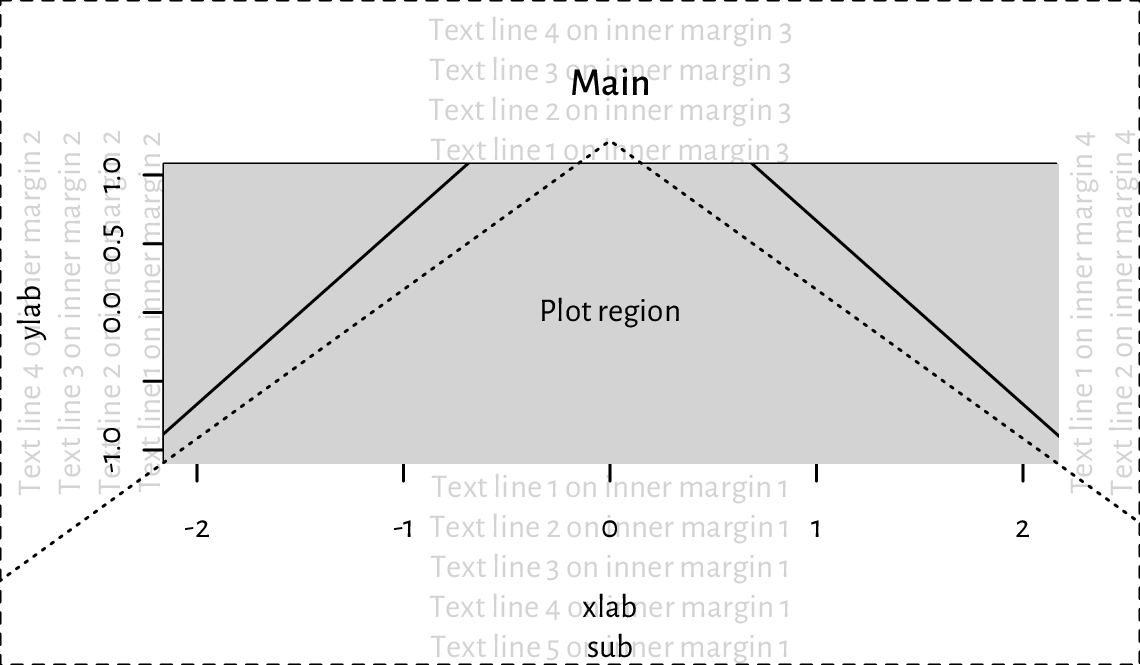
Figure 13.12 Figure layout with default inner and outer margins (mar=c(5.1, 4.1, 4.1, 2.1) and oma=c(0, 0, 0, 0) text lines, respectively). We see that a lot of space is wasted and hence some tweaking might be necessary to suit our needs better. Note the clipping of the solid line to the grey plot region.
13.2.3. User coordinates and axes
plot.window sets the user coordinates. It accepts the following parameters:
xlim,ylim– vectors of length two giving the minimal and maximal ranges on the respective axes; by default, they are extended by 4% in each direction for aesthetic reasons (see, e.g., Figure 13.12) but we can disable this behaviour by setting thexaxsandyaxsgraphics parameters;asp– aspect ratio \((y/x)\); defaults toNA, i.e., no adjustment; useasp=1for circles to look like ones, and not ovals;log– logarithmic scaling on particular axes:""(none; default),"x","y", or"xy".
The graphics parameter usr can be used to read (and set)
the extremes of the user coordinates in the form
\((x_1, x_2, y_1, y_2)\).
plot.new()
plot.window(c(-1, 1), c(1, 1000), log="y", yaxs="i")
par("usr")
## [1] -1.08  1.08  0.00  3.00
Indeed, the x-axis range was extended by 4% in each direction
(xaxs="r"). We have turned this behaviour off for the y-axis (yaxs="i"),
which uses the base-10 logarithmic scale. In this case, its actual range is
10^par("usr")[3:4]
because \(\log_{10} 1=0\) and \(\log_{10} 1000=3\).
Implement your version of the abline function using lines.
Even though axes (labels and tick marks) can be drawn manually using the aforementioned graphics primitives, it is usually too tedious a work. This is why we tend to rely on the axis function, which draws the object on one of the plot sides (as usual, 1=bottom, …, 4=right).
Once plot.window is called, axTicks
can be called to guesstimate the tasteful (round) locations for the tick
marks relative to the current plot size.
By default, they are based on the xaxp and yaxp graphics parameters,
which give the axis ranges and the number of intervals between
the tick marks.
plot.new(); plot.window(c(-0.9, 1.05), c(1, 11))
par("usr")  # (x1, x2, y1, y2)
## [1] -0.978  1.128  0.600 11.400
par("yaxp")  # (y1, y2, n)
## [1]  2 10  4
axTicks(2)  # left y-axis
## [1]  2  4  6  8 10
par("xaxp")  # (x1, x2, n)
## [1] -0.5  1.0  3.0
axTicks(1)  # bottom x-axis
## [1] -0.5  0.0  0.5  1.0
par(xaxp=c(-0.9, 1.0, 5))  # change
axTicks(1)
## [1] -0.90 -0.52 -0.14  0.24  0.62  1.00
axis relies on the same algorithm as axTicks. Alternatively, we can provide custom tick locations and labels.
Most of the plots in this book use the following graphics settings
(except las=1 to axis(2)); see
Figure 13.13. Check out
help("par"), help("axis"), etc. and tune them up to suit your needs.
par(mar=c(2.2, 2.2, 1.2, 0.6))
par(tcl=0.25)  # the length of the tick marks (fraction of text line height)
par(mgp=c(1.1, 0.2, 0))  # axis title, axis labels, and axis line location
par(cex.main=1, font.main=2)  # bold, normal size - main in title
par(cex.axis=0.8889)
par(cex.lab=1, font.lab=3)  # bold italic, normal size
plot.new(); plot.window(c(0, 1), c(0, 1))
# a "grid":
rect(par("usr")[1], par("usr")[3], par("usr")[2], par("usr")[4],
    col="#00000010")
abline(v=axTicks(2), col="white", lwd=1.5, lty=1)
abline(h=seq(0, 1, length.out=4), col="white", lwd=1.5, lty=1)
# set up axes:
axis(2, at=seq(0, 1, length.out=4), c("0", "1/3", "2/3", "1"), las=1)
axis(1)
title(xlab="xlab", ylab="ylab", main="main (use sparingly)")
box()
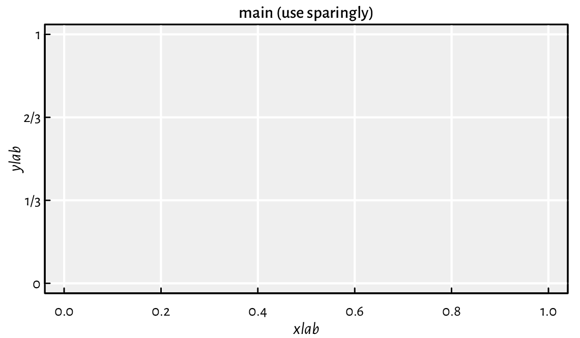
Figure 13.13 Custom axes and other settings.
13.2.4. Plot dimensions (*)
Certain sizes can be read or specified in inches (1” is exactly 25.4 mm):
pin– plot dimensions (width, height),fin– figure region dimensions,din– page (device) dimensions,mai– plot (inner) margin size,omi– outer margins,cin– the size of the “default” character (width, height).
If the figure is scaled, the virtual inch (the one reported by R) will not match the physical one (e.g., the actual size in the printed version of this book or on the computer screen).
Important
Most objects’ positions are specified
in virtual user coordinates, as given by usr.
They are automatically mapped to the physical device region,
taking into account the page size, outer and inner margins, etc.
Knowing the above, some scaling can be used to convert between the user
and physical sizes (in inches). It is based on the ratios
(usr[2]-usr[1])/pin[1] and (usr[4]-usr[3])/pin[2];
compare the xinch and yinch functions.
(*) Figure 13.14 shows how we can pinpoint the edges of the figure and device region in user coordinates.
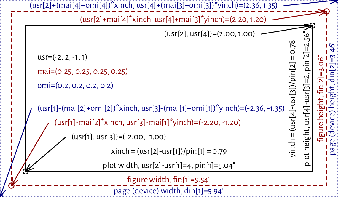
Figure 13.14 User vs device coordinates. Note that the virtual inch does not correspond to the physical one, as some scaling was applied.
(*) We cannot use mtext to print
text on the right inner margin rotated by 180 degrees
compared to what we see in Figure 13.12.
Write your version of this function that will allow you to
do so.
Hint: use text, the cin graphics parameter,
and what you can read from Figure 13.14.
13.2.5. Many figures on one page (subplots)
It is possible to create many figures on one page. In such a case, each subplot has its own inner margins and plot region.
A call to par(mfrow=c(nr, nc))
or par(mfcol=c(nr, nc))
splits the page into a regular grid with nr rows and nc columns.
Each invocation of plot.new starts a new figure.
Consecutive figures are either placed rowwisely (mfrow)
or in the column-major order (mfcol). Alternatively,
any subplot can be activated by referring to the mfg parameter.
Figure 13.15 depicts an example page with four figures aligned on a \(2\times 2\) grid.
par(oma=rep(1.2, 4))  # outer margins (default 0)
par(mfrow=c(2, 2))  # a 2x2 plot grid

for (i in 1:4) {
    plot.new()
    par(mar=c(3, 3, 2, 2))  # each subplot will have the same inner margins
    plot.window(c(i-1, i+1), c(-1, 1))  # separate user coordinates for each

    text(i, 0, sprintf("Plot region (plot %d)\n(%d, %d)", i,
        par("mfg")[1], par("mfg")[2]))

    box("figure", lty="dashed")  # a box around the figure region
    box("plot")   # a box around the plot region
    axis(1)  # horizontal axis (bottom)
    axis(2)  # vertical axis (left)
}

box("outer", lty="dotdash")  # a box around the whole page
for (i in 1:4)
    mtext(sprintf("Outer margin %d", i), side=i, outer=TRUE)
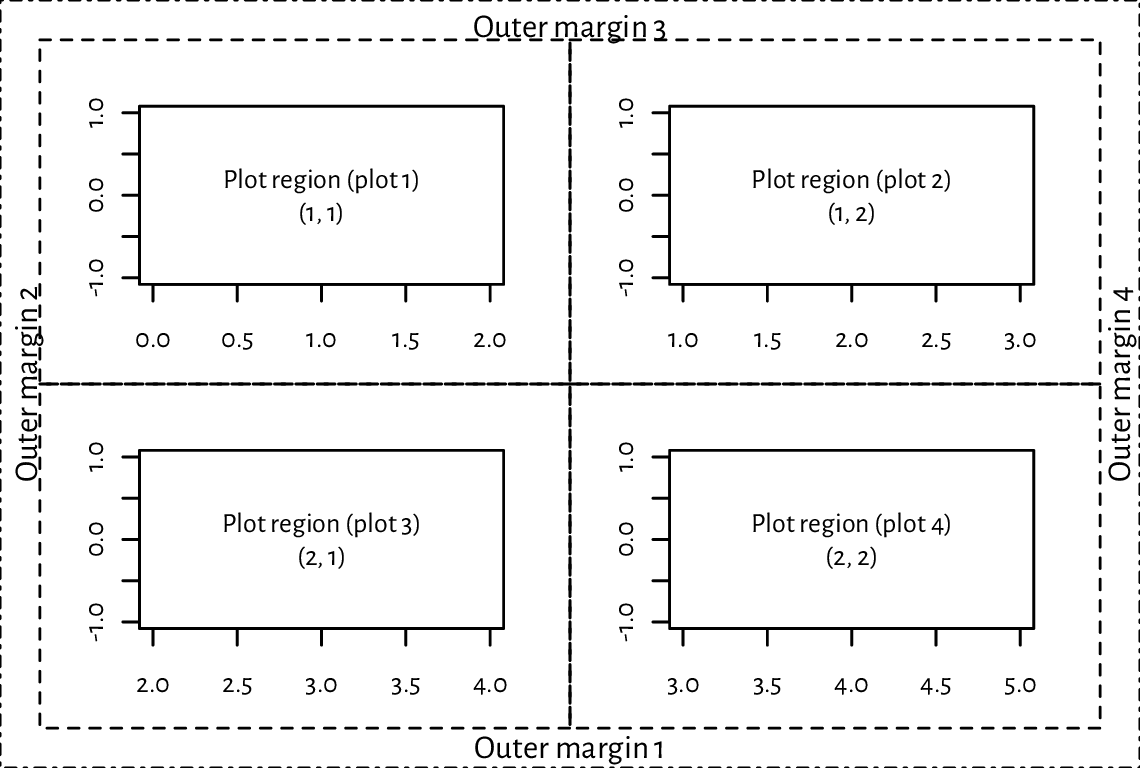
Figure 13.15 A page with four figures created using par(mfrow=c(2, 2)).
Thanks to mfrow and mfcol, we can create, e.g., a scatter plot matrix
or different trellis plots. If an irregular grid is required, we can call
the slightly more sophisticated layout function
(which is incompatible with mfrow and mfcol).
Examples will follow later; see
Figure 13.24 and Figure 13.26.
Also, the fig parameter (with new=TRUE to suppress the
creation of a new figure) creates a subplot in an arbitrary rectangular
region of the current page.
Certain grid sizes might affect the mex and cex parameters
and hence the default font sizes (amongst others).
Refer to the documentation of par for more details.
13.2.6. Graphics devices
Where our plots are displayed depends on our development environment
(Section 1.2). Users of JupyterLab see the plots embedded
into the current notebook, consumers of RStudio display them
in a dedicated Plots pane, working from the console opens a new graphics
window (unless we work in a text-only environment), whereas compiling
utils::Sweave or knitr
markup files brings about an image file that will be included
in the output document.
In practice, we might be interested in exercising our creative endeavours on different devices. For instance, to draw something in a PDF file, we can call:
Cairo::CairoPDF("figure.pdf", width=6, height=3.5)  # open "device"
# ... calls to plotting functions...
dev.off()  # save file, close device
Similarly, a call to CairoPNG or CairoSVG
creates a PNG or a SVG file.
In both cases, as we rely on the Cairo library,
we can customise the font family by calling
Cairo::CairoFonts.
Note
Typically, web browsers can display PNG, JPEG, and SVG files. On the other hand, PDF is a popular choice in printed publications (e.g., articles or books).
It is worth knowing that PNG and JPEG are raster graphics formats, i.e., they store figures as bitmaps (pixel matrices). They are fast to render, but the file sizes might become immense if we want decent image quality (high resolution). Most importantly, they should not be scaled: it is best to display them at their original widths and heights. However, JPEG uses lossy compression. Therefore, it is not a particularly fortunate file format for data visualisations. It does not support transparency either.
On the other hand, SVG and PDF files store vector graphics, where all primitives are described geometrically. This way, the image can be redrawn at any size and is always expected to be aesthetic. Unfortunately, scatter plots with millions of points will result in considerable files size and relatively slow rendition times (but there are tricks to remedy this).
Users of TeX should take note of
tikzDevice::tikz, which creates
TikZ files that can be rendered as standalone PDF files
or embedded in LaTeX documents (and its variants).
It allows for typesetting beautiful equations using the standard
"$...$" syntax within any R string.
Many other devices are listed in help("Devices").
Note
(*) The opened graphics devices form a stack. Calling dev.off will return to the last opened device (if any). See dev.list and other functions listed in its help page for more information.
Each device has separate graphics parameters. When opening a new device, we start with default settings in place.
Also, dev.hold and dev.flush can suppress the immediate display of the plotted objects, which might increase the drawing speed on certain interactive devices.
The current plot can be copied to another device (e.g., a PDF file) using dev.print.
(*) Create an animated PNG displaying a large point sliding along the sine curve. Generate a series of video frames like in Figure 13.16. Store each frame in a separate PNG file. Then, use ImageMagick (compare Section 7.3.2 or rely on another tool) to combine these files as a single animated PNG.
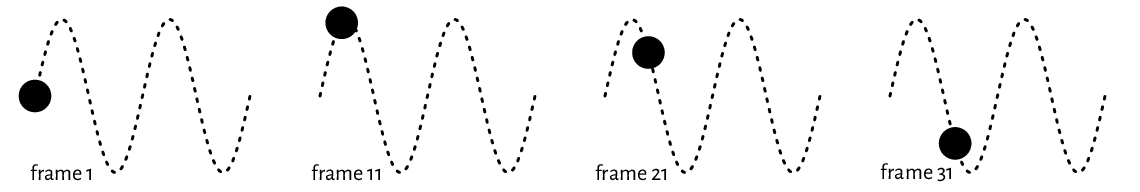
Figure 13.16 Selected frames of an example animation. They can be stored in separate files and then combined as a single animated PNG.
13.3. Higher-level functions
Higher-level plotting commands call plot.new, plot.window, axis, box, title, etc., and draw graphics primitives on our behalf. They provide ready-to-use implementations of the most common data visualisation tools, e.g., box-and-whisker plots, histograms, pairs plots, etc. Below we review a few of them. We also show how they can be customised or even rewritten from scratch if we are not completely happy with them. They will inspire us to practice lower-level graphics programming.
Check out the meaning of the ask, new, xaxt, yaxt, and ann
graphics parameters and how they affect plot.new, axis,
title, and so forth.
13.3.1. Scatter and function plots with plot.default and matplot
The default method for the S3 generic plot is a convenient wrapper around points and lines.
plot.default can draw a scatter plot of a set of points
in \(\mathbb{R}^2\) possibly grouped by another categorical variable.
From Section 10.3.2 we know that a factor is represented as a vector
of small natural numbers. Therefore, its underlying level codes
can be used directly as col or pch specifiers;
see Figure 13.17 for a demonstration.
Take note of a call to the legend function.
plot(
    jitter(iris[["Sepal.Length"]]),  # x (it is a numeric vector)
    jitter(iris[["Petal.Width"]]),   # y (it is a numeric vector)
    col=as.numeric(iris[["Species"]]),  # colours (integer codes)
    pch=as.numeric(iris[["Species"]]),  # plotting symbols (integer codes)
    xlab="Sepal length", ylab="Petal width",
    asp=1  # y/x aspect ratio
)
legend(
    "bottomright",
    legend=levels(iris[["Species"]]),
    col=seq_along(levels(iris[["Species"]])),
    pch=seq_along(levels(iris[["Species"]])),
    bg="white"
)
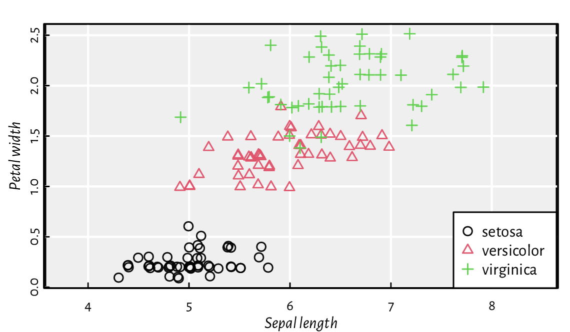
Figure 13.17 as.numeric can define different plotting styles for each factor level.
Pass ann=FALSE and axes=FALSE to plot to
suppress the addition of axes and labels. Then, draw them manually
using the functions discussed in the previous section.
Draw a plot of the \(y=\sin x\) function using plot. Then, call lines to add \(y=\cos x\). Later, do the same using a single reference to matplot. Include a legend.
Semi-transparency may convey additional information. Figure 13.18 shows two scatter plots of adult females’ weights vs heights. If the points are fully opaque, we cannot judge the density around them. On the other hand, translucent symbols somewhat imitate the two-dimensional histograms that we will later depict in Figure 13.29.
nhanes <- read.csv(paste0("https://raw.githubusercontent.com/gagolews/",
        "teaching-data/master/marek/nhanes_adult_female_bmx_2020.csv"),
    comment.char="#", col.names=c("weight", "height", "armlen", "leglen",
        "armcirc", "hipcirc", "waistcirc"))
par(mfrow=c(1, 2))
for (col in c("black", "#00000010"))
    plot(nhanes[["height"]], nhanes[["weight"]], col=col,
        pch=16, xlab="Height", ylab="Weight")
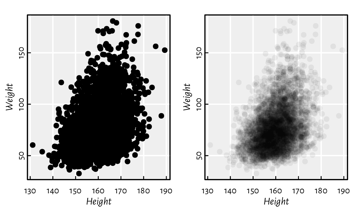
Figure 13.18 Semi-transparent symbols can reflect the points’ distribution density.
Figure 13.19 depicts the average monthly temperatures in your next holiday destination: Warsaw, Poland (a time series). Note that the translucent ribbon representing the low-high average temperature intervals was added using a call to polygon.
# Warsaw monthly temperatures; source: https://en.wikipedia.org/wiki/Warsaw
high <- c( 0.6,  1.9,  6.6, 13.6, 19.5, 21.9,
          24.4, 23.9, 18.4, 12.7,  5.9,  1.6)
mean <- c(-1.8, -0.6,  2.8,  8.7, 14.2, 17.0,
          19.2, 18.3, 13.5,  8.5,  3.3, -0.7)
low  <- c(-4.2, -3.6, -0.6,  3.9,  8.9, 11.8,
          13.9, 13.1,  9.1,  4.8,  0.6, -3.0)
matplot(1:12, cbind(high, mean, low), type="o", col=c(2, 1, 4), lty=1,
    xlab="month", ylab="temperature [°C]", xaxt="n", pch=16, cex=0.5)
axis(1, at=1:12, labels=month.abb, line=-0.25, lwd=0, lwd.ticks=1)
polygon(c(1:12, rev(1:12)), c(high, rev(low)), border=NA, col="#ffff0033")
legend("bottom", c("average high", "mean", "average low"),
    lty=1, col=c(2, 1, 4), bg="white")
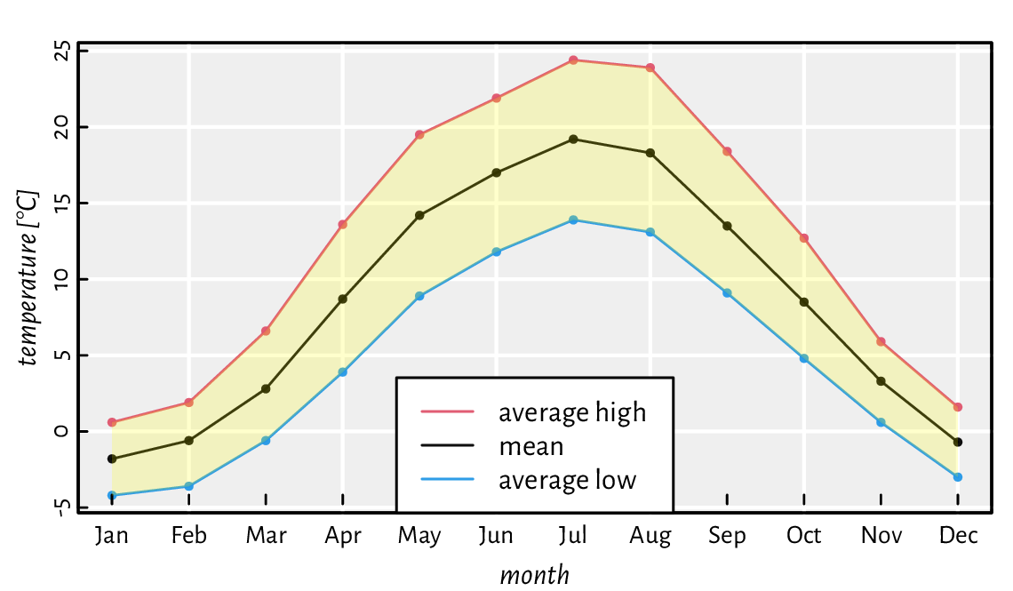
Figure 13.19 Example time series. A semi-transparent ribbon was added by calling polygon to highlight the area between the low-high ranges (intervals).
Figure 13.20 depicts a scatter plot similar to Figure 13.18, but now with the points’ hue being a function of a third variable.
midpoints <- function(x) 0.5*(x[-1]+x[-length(x)])
z <- nhanes[["waistcirc"]]
breaks <- seq(min(z), max(z), length.out=10)
zf <- cut(z, breaks, include.lowest=TRUE)
col <- hcl.colors(nlevels(zf), "Viridis", alpha=0.5)
layout(matrix(c(1, 2), nrow=1),  # two plots in one page
    widths=c(1, lcm(3)))         # second one is of width "3cm" (scaled)
# first subplot:
plot(nhanes[["height"]], nhanes[["weight"]], col=col[as.numeric(zf)],
    pch=16, xlab="Height", ylab="Weight")
# second subplot:
par(mar=c(2.2, 0.6, 2.2, 0.6))
plot.new(); plot.window(c(0, 1), c(0, nlevels(zf)))
rasterImage(as.matrix(rev(col)), 0, 0, 1, nlevels(zf), interpolate=FALSE)
text(0.5, 1:nlevels(zf)-0.5, sprintf("%3.0f", midpoints(breaks)))
mtext("Waist Ø", side=3)
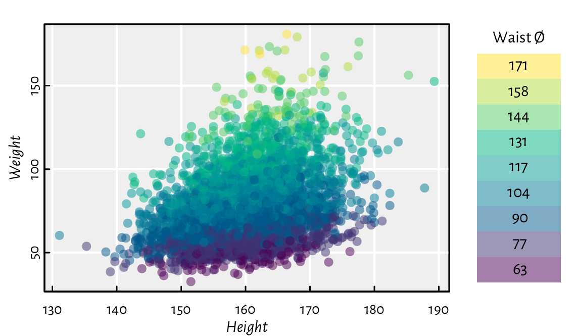
Figure 13.20 A 2D scatter plot with a third variable represented by colours.
Implement your version of pairs, being the function to draw a scatter plot matrix (a pairs plot).
ecdf returns an object of the S3 classes ecdf and stepfun.
There are plot methods overloaded for them. Inspect their source
code. Then, inspired by this, create a function to compute and display
the empirical cumulative distribution function corresponding to a given
numeric vector.
spline performs cubic spline interpolation,
whereas smooth.spline determines a smoothing spline
of a given two-dimensional dataset.
Plot different splines for cars[["dist"]] as a function
of cars[["speed"]]. Which of these two functions is more appropriate
for depicting this dataset?
13.3.2. Bar plots and histograms
A bar plot is drawn using a series of rectangles (i.e., certain polygons) of different heights (or widths, if we request horizontal alignment).
Let’s visualise the dataset listing the most frequent causes of medication errors (data are fabricated):
cat_med = c(
    "Unauthorised drug", "Wrong IV rate", "Wrong patient", "Dose missed",
    "Underdose", "Wrong calculation","Wrong route", "Wrong drug",
    "Wrong time", "Technique error", "Duplicated drugs", "Overdose"
)
counts_med = c(1, 4, 53, 92, 7, 16, 27, 76, 83, 3, 9, 59)
A Pareto chart combines a bar plot featuring bars of decreasing heights with a cumulative percentage curve; see Figure 13.21.
o <- order(counts_med)
cato_med <- cat_med[o]
pcto_med <- counts_med[o]/sum(counts_med)*100
cumpcto_med <- rev(cumsum(rev(pcto_med)))
# bar plot of percentages
par(mar=c(2.2, 0.6, 2.2, 6.6))  # wide left margin
midp <- barplot(pcto_med, horiz=TRUE, xlab="%",
    col="white", xlim=c(0, 25), xaxs="r", yaxs="r", yaxt="n",
    width=3/4, space=1/3)
text(pcto_med, midp, sprintf("%.1f%%", pcto_med), pos=4, cex=0.89)
axis(4, at=midp, labels=cato_med, las=1)
box()
# cumulative percentage curve in a new coordinate system
par(usr=c(-4, 104, par("usr")[3], par("usr")[4]))  # 0-100 with 4% addition
lines(cumpcto_med, midp, type="o", col=4, pch=18)
axis(3, col=4)
mtext("cumulative %", side=3, line=1.2, col=4)
text(cumpcto_med, midp, sprintf("%.1f%%", cumpcto_med), cex=0.89, col=4,
    pos=c(4, 2)[(cumpcto_med>80)+1], offset=0.5)
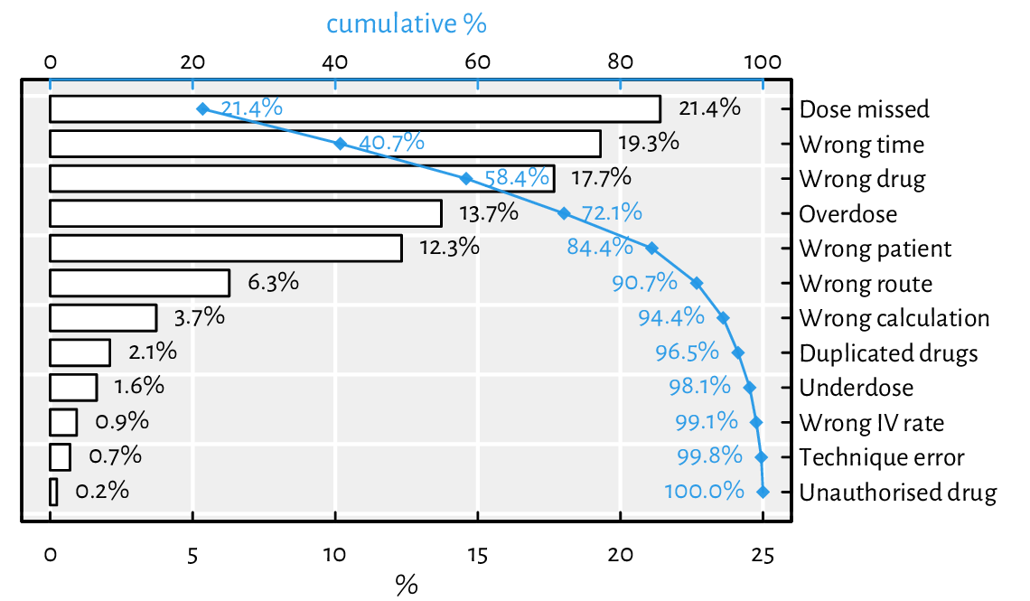
Figure 13.21 An example Pareto chart (a fancy bar plot). Double axes have a general tendency to confuse the reader.
Note that barplot returned the midpoints of the bars,
which we put in good use.
By default, it sets the xaxs="i" graphics parameter and thus
does not extend the x-axis range by 4% on both sides. This would not make
us happy here, therefore we needed to change it manually.
Draw a bar plot summarising, for each passenger class and sex,
the number of adults who did not survive the sinking of the deadliest
1912 cruise; see Figure 13.22 and the
Titanic dataset.
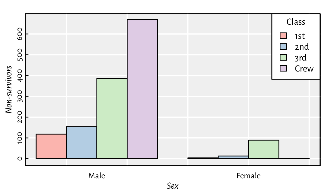
Figure 13.22 An example bar plot representing a two-way contingency table.
Implement your version of barplot, but where the bars are placed precisely at the positions specified by the user, e.g., allowing the bar midpoints to be consecutive integers.
We will definitely not cover the (in)famous pie charts in our book. The human brain is not very skilled at judging the relative differences between the areas of geometric objects. Also, they are ugly (pie charts, not geometric objects in general).
Moving on: a histogram is a simple density estimator for continuous data. It can be thought of as a bar plot with bars of heights proportional to the number of observations falling into the corresponding disjoint intervals. Most often, there is no space between the bars to emphasise that the intervals cover the whole data range.
A histogram can be computed and drawn using the high-level function hist; see Figure 13.23.
par(mfrow=c(1, 2))
for (breaks in list("Sturges", 25)) {
    # Sturges (a heuristic) is the default; any value is merely a suggestion
    hist(iris[["Sepal.Length"]], probability=TRUE, xlab="Sepal length",
        main=NA, breaks=breaks, col="white")
    box()  # oddly, we need to add it manually
}
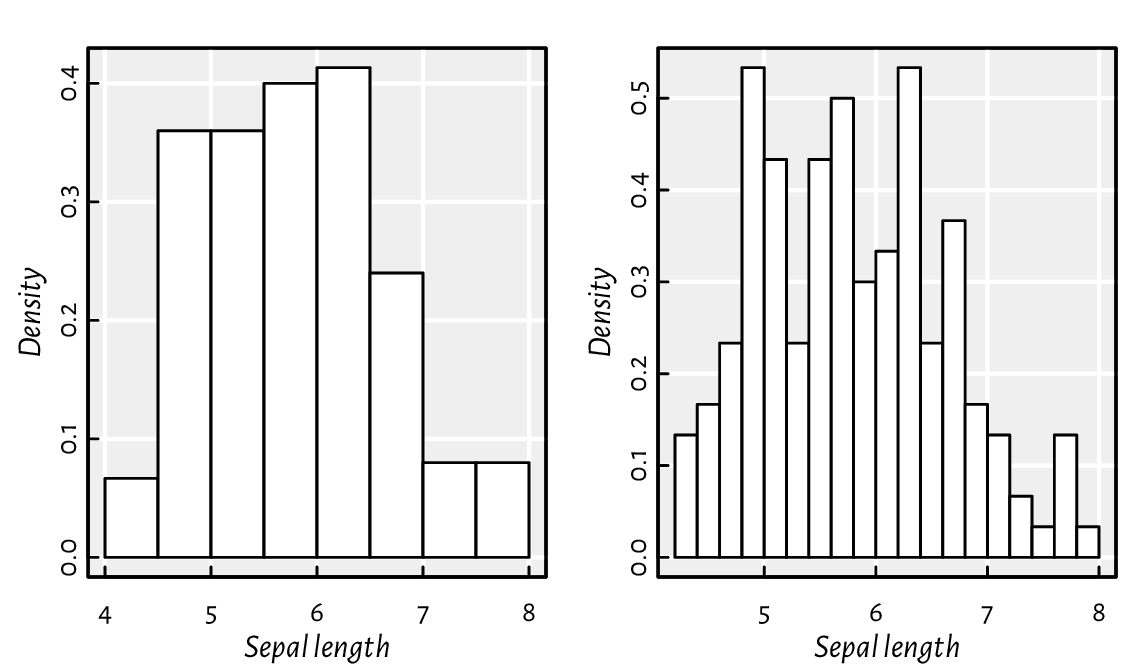
Figure 13.23 Example histograms for the same dataset.
Study the source code of hist.default.
Note the invisibly-returned list of the S3 class histogram.
Then, study graphics:::plot.histogram.
Implement similar functions yourself.
Modify your function to draw a scatter plot matrix so that it gives the histograms of the marginal distributions on its diagonal.
Using layout mentioned in Section 13.2.5,
we can draw a scatter plot with marginal histograms;
see Figure 13.24.
Note that we split the page into four plots of unequal sizes,
but the upper right part of the grid is unused.
We use hist for binning only (plot=FALSE). Then,
barplot is utilised for drawing as it gives greater control
over the process (e.g., supports vertical layout).
layout(matrix(
    c(1, 1, 1, 0,  # the first row: the first plot of width 3 and nothing
      3, 3, 3, 2,  # the third plot (square) and the second (tall) in 3 rows
      3, 3, 3, 2,
      3, 3, 3, 2), nrow=4, byrow=TRUE))
par(mex=1, cex=1)  # the layout function changed this!
x <- jitter(iris[["Sepal.Length"]])
y <- jitter(iris[["Sepal.Width"]])
# the first subplot (top)
par(mar=c(0.2, 2.2, 0.6, 0.2), ann=FALSE)
hx <- hist(x, plot=FALSE, breaks=seq(min(x), max(x), length.out=20))
barplot(hx[["density"]], space=0, axes=FALSE, col="#00000011")
# the second subplot (right)
par(mar=c(2.2, 0.2, 0.2, 0.6), ann=FALSE)
hy <- hist(y, plot=FALSE, breaks=seq(min(y), max(y), length.out=20))
barplot(hy[["density"]], space=0, axes=FALSE, horiz=TRUE, col="#00000011")
# the third subplot (square)
par(mar=c(2.2, 2.2, 0.2, 0.2), ann=TRUE)
plot(x, y, xlab="Sepal length", ylab="Sepal width",
    xlim=range(x), ylim=range(y))  # default xlim, ylim
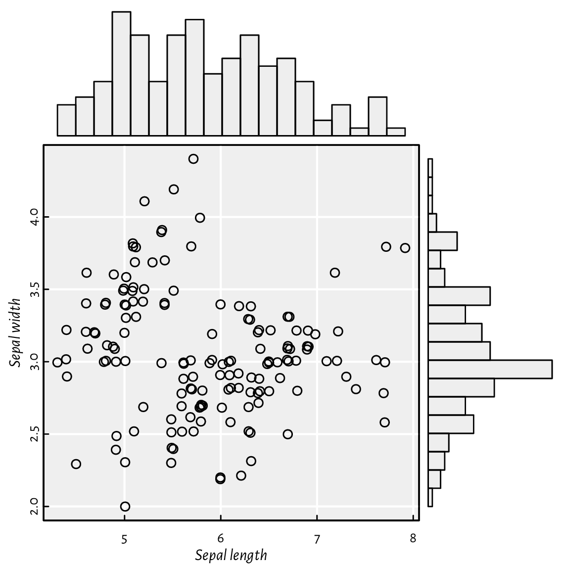
Figure 13.24 A scatter plot with marginal histograms: three (four) plots on one page, but on a nonuniform grid created using layout.
(*)
Kernel density estimators (KDEs) are another way to guesstimate
the data distribution. The density function, for a given
numeric vector, returns a list with, amongst others,
the x and y coordinates of the points that we can pass directly to
the lines function.
Below we depict the KDEs of data split into three groups;
see Figure 13.25.
adjust_transparency <- function(col, alpha)
    rgb(t(col2rgb(col)/255), alpha=alpha)  # alpha in [0, 1]

pal <- adjust_transparency(palette(), 0.2)
kdes <- lapply(split(iris[["Sepal.Length"]], iris[["Species"]]), density)
matplot(sapply(kdes, `[[`, "x"), sapply(kdes, `[[`, "y"),
    type="l", xlab="Sepal length", ylab="density", lwd=1.5)
for (i in seq_along(kdes))
    polygon(kdes[[i]][["x"]], kdes[[i]][["y"]], col=pal[i], border=NA)
legend("topright", legend=levels(iris[["Species"]]), bg="white", lwd=1.5,
    col=seq_along(levels(iris[["Species"]])),
    lty=seq_along(levels(iris[["Species"]])))
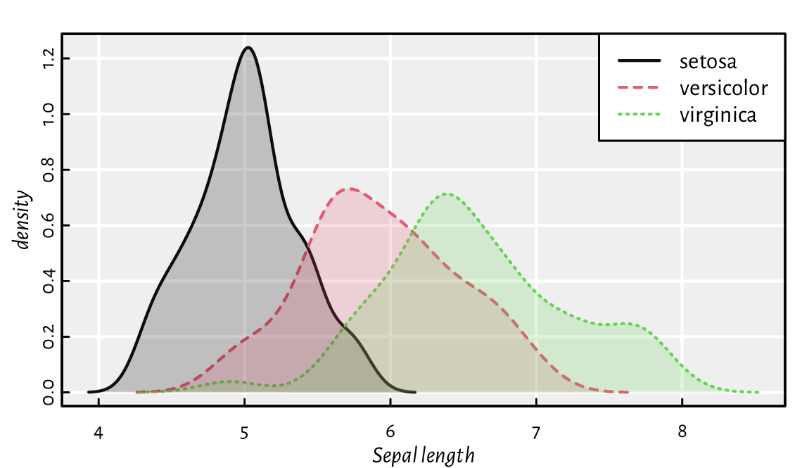
Figure 13.25 Kernel density estimators of sepal length split by species in the iris dataset. Note the semi-transparent polygons (again).
(*) Implement a function that draws kernel density estimators for a given numeric variable split by a combination of three factor levels; see Figure 13.26 for an example.
grid_kde <- function(data, values, x, y, hue) ...to.do...

tips <- read.csv(paste0("https://raw.githubusercontent.com/gagolews/",
        "teaching-data/master/other/tips.csv"),
    comment.char="#", stringsAsFactors=TRUE)
head(tips, 3)  # preview this example dataset
##   total_bill  tip    sex smoker day   time size
## 1      16.99 1.01 Female     No Sun Dinner    2
## 2      10.34 1.66   Male     No Sun Dinner    3
## 3      21.01 3.50   Male     No Sun Dinner    3
grid_kde(tips, values="tip", x="smoker", y="time", hue="sex")
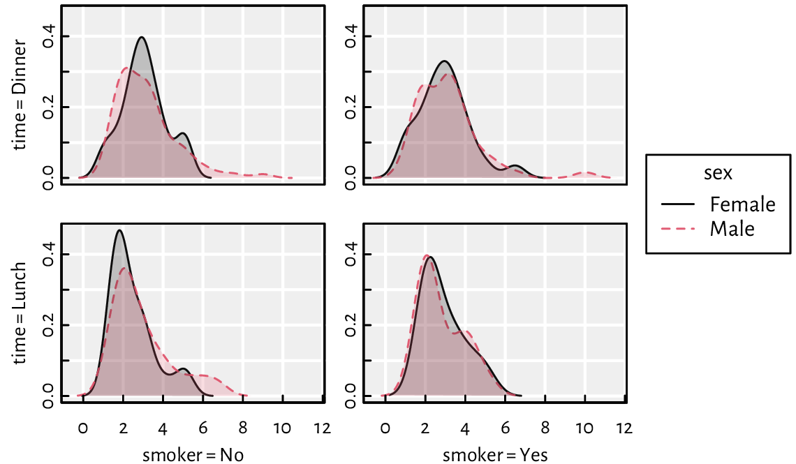
Figure 13.26 An example grid plot (also known as a trellis, panel, conditioning, or lattice plot) with kernel density estimators for a numeric variable (amount of tip in a US restaurant) split by a combination of three factor levels (smoker, time, sex).
13.3.3. Box-and-whisker plots
We have already seen a chart generated by the boxplot function in Figure 5.1. Tinkering with it will give us robust practice, which in turn shall make us perfect.
Modify the code generating Figure 5.1 so that:
same
doses are grouped together (more space between differentdoses added; also, on the x-axis, only uniquedoses are printed),different
supps have different colours (add a legend explaining them).
Write a function for drawing box plots using graphics primitives.
(*) Write a function for drawing violin plots. They are similar to box plots but use kernel density estimators.
(*) Implement a bag plot, which is a two-dimensional version of a box plot. Use chull to compute the convex hull of a point set.
13.3.4. Contour plots and heat maps
image is a convenient wrapper around rasterImage, which can draw contour plots, two-dimensional histograms, heatmaps, etc. In particular, when plotting a function of two variables like \(z=f(x, y)\), the magnitude of the \(z\) component can be expressed using colour brightness or hue.
Figure 13.27 presents a filled contour plot of Himmelblau’s function, \(f(x,y)=(x^{2}+y-11)^{2}+(x+y^{2}-7)^{2}\), for \(x\in[-5, 5]\) and \(y\in[-4, 4]\). A call to contour adds labelled contour lines (which is actually a nontrivial operation).
x <- seq(-5, 5, length.out=250)
y <- seq(-4, 4, length.out=200)
z <- outer(x, y, function(xg, yg) (xg^2 + yg - 11)^2 + (xg + yg^2 - 7)^2)
image(x, y, z, col=grey(seq(1, 0, length.out=16)))
contour(x, y, z, nlevels=16, add=TRUE)
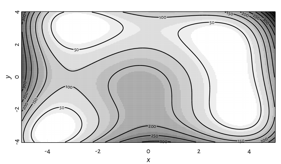
Figure 13.27 A filled contour plot with labelled contour lines.
In image, the number of rows in z matches the length of x,
whereas the number of columns is equal to the size of y.
This might be counterintuitive; when z is printed,
the image is its 90-degree rotated version.
Figure 13.28 presents an example heatmap
depicting Pearson’s correlations between all pairs of variables
in the nhanes data frame which we loaded some time ago.
o <- c(6, 5, 1, 7, 4, 2, 3)  # order of rows/cols (by similarity)
R <- cor(nhanes[o, o])
par(mar=c(2.8, 7.6, 1.2, 7.6), ann=FALSE)
image(1:NROW(R), 1:NCOL(R), R,
    ylim=c(NROW(R)+0.5, 0.5),
    zlim=c(-1, 1),
    col=hcl.colors(20, "BluGrn", rev=TRUE),
    xlab=NA, ylab=NA, asp=1, axes=FALSE)
axis(1, at=1:NROW(R), labels=dimnames(R)[[1]], las=2, line=FALSE, tick=FALSE)
axis(2, at=1:NCOL(R), labels=dimnames(R)[[2]], las=1, line=FALSE, tick=FALSE)
text(arrayInd(seq_along(R), dim(R)),
    labels=sprintf("%.2f", R),
    col=c("white", "black")[abs(R<0.8)+1],
    cex=0.89)
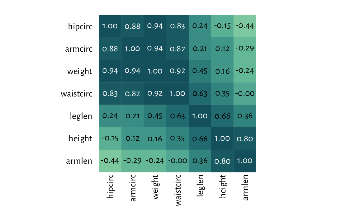
Figure 13.28 A correlation heatmap drawn using image.
Check out the heatmap function, which uses hierarchical clustering to find an aesthetic reordering of the matrix’s items.
Figure 13.29 depicts a two-dimensional histogram. It approaches the idea of reflecting the points’ density differently from the semi-transparent symbols in Figure 13.18.
histogram_2d <- function(x, y, k=25, ...)
{
    breaksx <- seq(min(x), max(x), length.out=k)
    fx <- cut(x, breaksx, include.lowest=TRUE)
    breaksy <- seq(min(y), max(y), length.out=k)
    fy <- cut(y, breaksy, include.lowest=TRUE)
    C <- table(fx, fy)
    image(midpoints(breaksx), midpoints(breaksy), C,
        xaxs="r", yaxs="r", ...)
}

par(mfrow=c(1, 2))
for (k in c(25, 50))
    histogram_2d(nhanes[["height"]], nhanes[["weight"]], k=k,
        xlab="Height", ylab="Weight",
        col=c("#ffffff00", hcl.colors(25, "Viridis", rev=TRUE))
    )
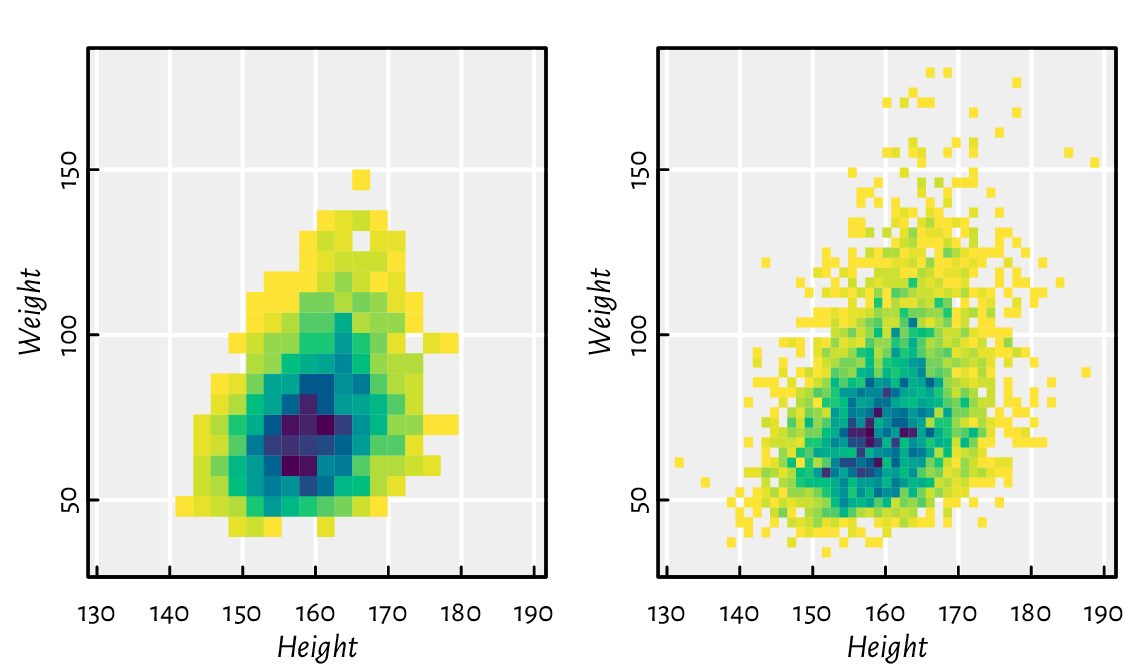
Figure 13.29 Two-dimensional histograms with different numbers of bins, where the bin count is reflected by the colour.
(*) Implement some two-dimensional kernel density estimator and plot it using contour.
13.4. Exercises
Answer the following questions.
Can functions from the graphics package be used to adjust the plots generated by lattice and ggplot2?
What are the most common graphics primitives?
Can all high-level functions be implemented using low-level ones? As an example, discuss the key ingredients used in barplot.
Some high-level functions discussed in this chapter carry the
addparameter. What is its purpose?What are the admissible values of
pchandlty? Also, in the default palette, what is the meaning of colours1,2, …,16? Can their meaning be changed?Can all graphics parameters be changed?
What is the difference between passing
xaxt="n"to plot.default vs setting it with par, and then calling plot.default?Which graphics parameters are set by plot.window?
What is the meaning of the
usrparameter when using the logarithmic scale on the x-axis?(*) How to place a plotting symbol exactly 1 centimetre from the top-left corner of the current page (following the page’s diagonal)?
Semi-transparent polygons are nice, right?
Can an ellipse be drawn using polygon?
What happens when we set the graphics parameter
mfrow=c(2, 2)?How to export the current plot to a PDF file?
Draw the 2022 BTC-to-USD close rates time series. Then, add the 7- and 30-day moving averages. (*) Also, fit a local polynomial (moving) regression model using the Savitzky–Golay filter (see loess).
(*) Draw (from scratch) a candlestick plot for the 2022 BTC-to-USD rates.
(*) Create a function to draw a normal quantile-quantile (Q-Q) plot, i.e., for inspecting whether a numeric sample might come from a normal distribution.
(*) Draw a map of the world, where each country is filled with a colour whose brightness or hue is linked to its Gini index of income inequality. You can easily find the data on Wikipedia. Try to find an open dataset that gives the borders of each country as vertices of a polygon (e.g., in the form of a (geo)JSON file).
Next time you see a pleasant data visualisation somewhere, try to reproduce it using base graphics.
For further information on graphics generation in R, see, e.g., Chapter 12 of [59], [49], and [53]. Good introductory textbooks to data visualisation as an art include [57, 60].
In this chapter, we were only interested in static graphics, e.g., for use in printed publications or plain websites. Interactive plots that a user might tinker with in a web browser are a different story.
And so the second part of our delightful course is ended.